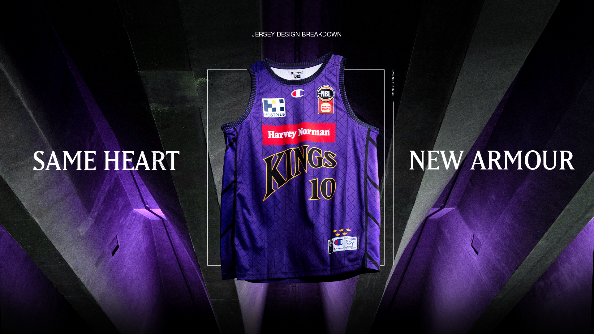
Kings unveil uniforms for blockbuster NBL25 season

With the tip-off of NBL25 just over a month away, the Sydney Kings are excited to unveil their jerseys for the blockbuster 2024-25 season.
This season's home and away jerseys for the Kings are slightly different from those in NBL24, with the design leaning into the mentality of 'same heart, new armour'.
As Hoops Capital's design lead Za Rathie explains, the thinking behind this year's jersey was 'authentically Sydney, distinctly Kings'.
"This season’s uniforms have several exciting, new changes," Rathie said.
"These changes aren’t made without consideration, the goal has been to establish a genuine link between the city of Sydney and the namesake Kings all while maintaining the spirit of our history.
"For a team that is at the intersection of many basketball brands, it’s about developing a unique brand space for the Sydney Kings to operate in."
PURCHASE YOUR NBL25 FULL-SEASON MEMBERSHIP NOW
During the NBL25 campaign, Kings fans will see a distinctly Sydney-inspired look this season, blending the architecture of the Sydney Opera House, drawing on its royal connections through medieval scale armour and the main elements in Kings uniform and logo history.
"This season, there are numerous changes, starting with the new wordmarks," Rathie said.
"They mirror the shape and curve of the Opera House sails – a shape present throughout the history of the Kings' logos.
"Our new font, blends the serif lettering used in all primary Kings logos, borrowing the sharpness of the speed lines of our primary mark, and maintaining a royal connection feel.
"The wordmarks seek to maintain the spirit of the primary logo that has been heralded on the front of many Kings jerseys.
"Next, you will see a new take on the Kings' pinstripes – a design element that has been a constant in Kings' uniform design.
"The new pattern is a unique blend of scale armour – a type of armour constructed from layered individual scales, worn by warriors throughout history - mixed with the concrete tiles of the Opera House and the vertical lines of our pinstripes - literally wearing the city as their armour.
THREADS FIT FOR A KING 👑#WeTheKings pic.twitter.com/jOapJK5SCf
— Sydney Kings (@SydneyKings) August 25, 2024
"The tiles of the Opera House are attached in chevron-shaped congruent shells like how scale armour is created through placement of individual overlapping scales – you will see these shapes present on the side panels of the uniform.
"The dashed line trim on the jersey neck and sleeves is again a nod to the details of the Opera House’s edge finish.
"Finally, above the tag on the jersey, we have maintained the five crowns symbolising the club's five NBL championships."
Not only will these designs align with Greater Sydney but always the club's Hoops Capital brand.
"As the name suggests, Hoops Capital seeks to be at the forefront of basketball in Australia," Rathie said.
"These designs celebrate our city.
"The Kings now wear the city as their armour, representing the Hoops Capital across the country, wherever they play."
PURCHASE YOUR KINGS HOME GAME TICKETS NOW
Rathie also made it a point to have this design align with the team's championship ambitions in NBL25.
"My hope with this new uniform is that it serves as a reminder and motivator to the Kings squad about the city they represent and who they’re playing for," said Rathie, who outlined the away uniforms were identical in style to the home, with only white replacing purple as the dominant colour and 'Sydney' on the front instead of 'Kings'.
"A new uniform serves as a blank canvas for the team to write their own history onto, and for us, that’s the campaign towards championship number six."
These new jerseys will be available via the Kings' store on Wednesday, September 4 at 10am.


